The concept art you see for many games is usually a little different from the final version that you see when you play. Sometimes it isn’t, but that’s normally because it isn’t concept art at all, but rather illustration for the purposes of marketing materials. We aren’t going to bother talking about that today though.
Today, we are going to go over the concept idea for the characters in Space Time, and how they changed over time, why parts changed, and also some unexpected user feedback that focused our choices.
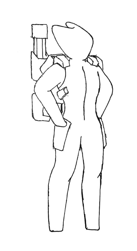
This was the original doodle we decided to move forward with. I can’t show all the rejects from doodle stage because I don’t have the doodles. I’m in France right now and the piece of paper may be in my office, at home, or more likely, already recycled. Besides, each picture takes ages to upload so be happy they aren’t all 16×16 pixel icons.
Anyway. Back to the concepts. Some had feet and club hands, although there were never to be any distinguishable fingers because I wanted to keep a fairly low poly and bone count for the finished characters. Before this design the designs had been a little more generic in terms of biological features and gender signifiers, but too my surprise when asking players and randos alike, many of whom were children, the overwhelming majority wished to have a distinct male and female character, even though they liked the fairly featureless look of the face and extremities. That is what brought us to the coloured selection you have seen before.
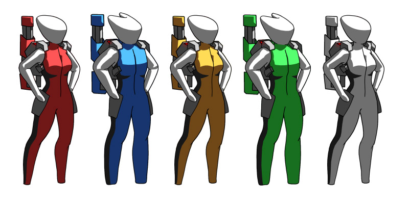
The model based on the male design here was the first one that made it into the game. I hadn’t bothered making the arms white though, because it was obvious shortly after colouring this, that I would have to make either the helmet or arms adopt the team colour, so that the team colour would remain clearly represented, even from the far-removed top view. At this point the general colour blocking was far more important than the overall shapes, but once the menu became 3D and the characters were able to be viewed closer and more from the side, I thought it best to mix things up and create a variety of shaped characters, while keeping the colour blocking and helmet the same (as that bit wouldn’t change from the top view). The resulting shapes were as follows.
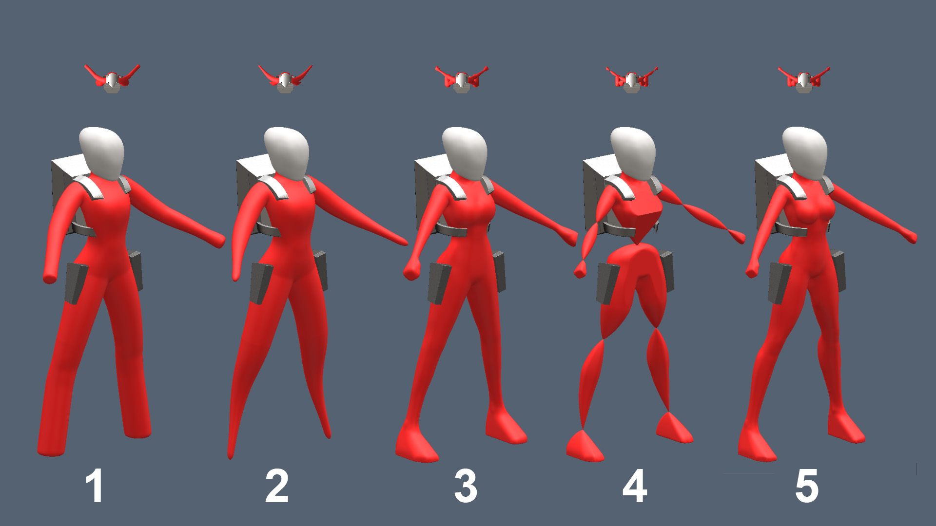
This was when we got some interesting feedback. The numbering below has nothing to do with what order they were created in. That order would be 1, 3, 5, 2, 4. I personally like number 2 the best. It’s very stylised and I like the overall curves that it creates, but it wasn’t the character style that was most chosen. Almost universally the favourite was 5, the most realistic person in the group. This was true regardless of the age or gender of the selector, and true for both the male and female character models.
So where I started with the intention to make the characters a generic, sexless, speciesless entity, the preference of the end users appears to be a generic, fairly human shaped character that can be easily categorised as male or female. I figured at least kids would go for the more abstractly shaped character but apparently not. I shouldn’t be surprised since that is exactly what scientific studies have generally shown about preferences, but it’s still interesting.
The design as it stands now is looking a little like this.
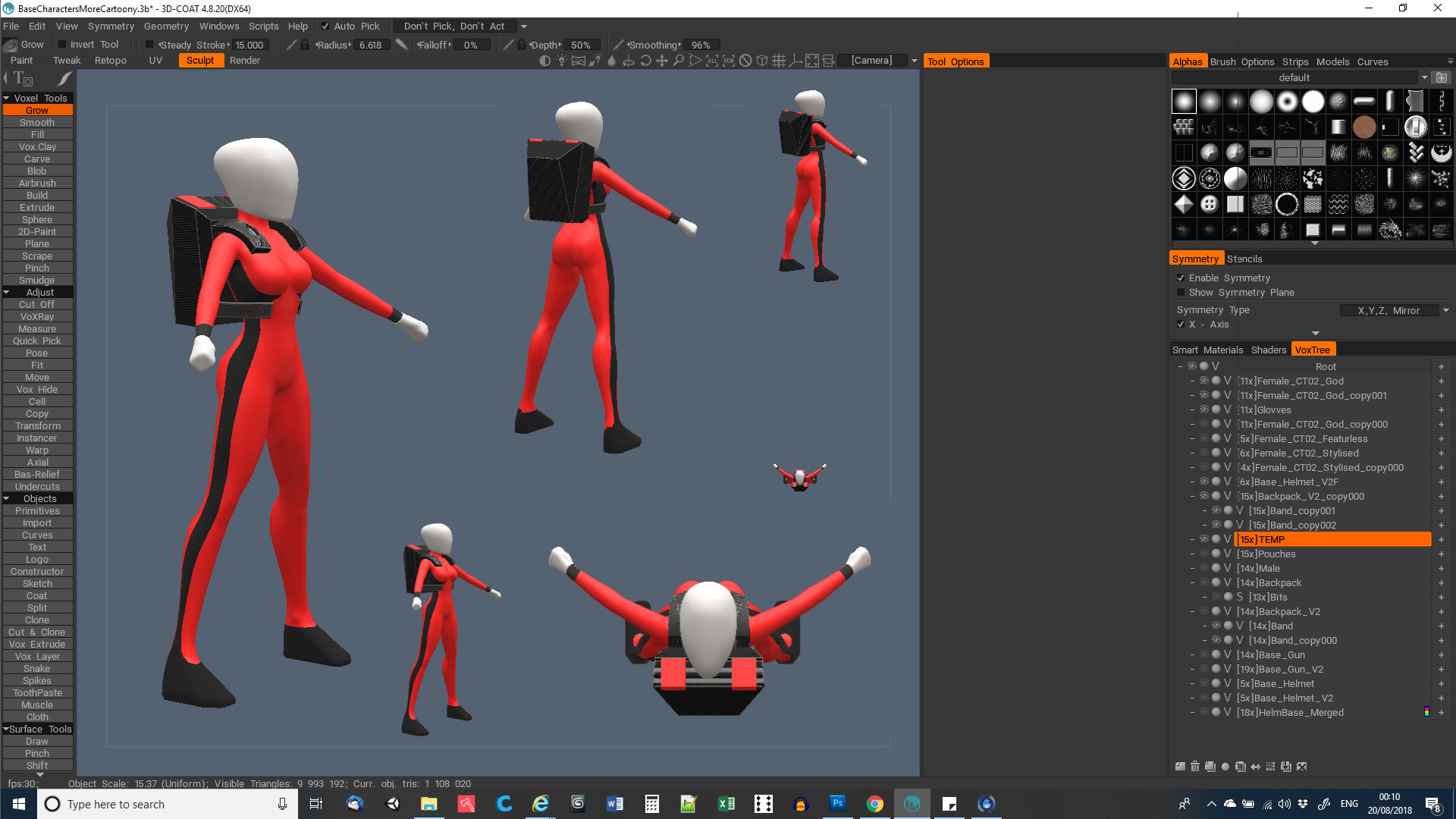
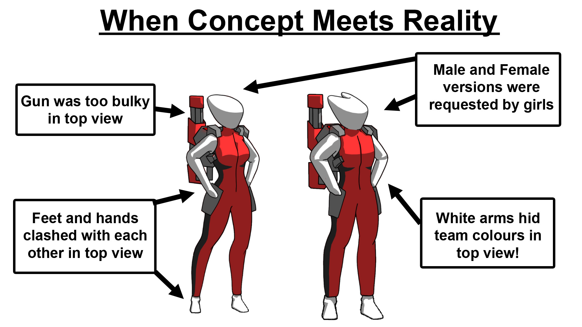
You can see there are still a vew differences from the concept at the start of this post. Each change has a reason behind it as stated on that image. The gun and backpack were too blocky in game, so the chunky look was toned down, and the gun will be reimagined as a multi-purpose fold-out rifle, that can be pulled out of the large pistol holster. This means that it will be a little sleeker looking, and also it will be more obvious if the character is in a fighting state or not.
The white trainers had to go. The white gloves work great and are very readable in the Mickey Mouse way you would expect them to be, but the shoes beneath clashed a bit with the hands, so using some very old, but still valid logic, we chose to make them a darker colour so that they read beneath the lighter colours of the torso.
Moving forward the character will get some more detail on the texture pass, a design for the weapon, and a couple of glowy bits, then finally integrated into the game properly to replace the placeholder guy.
Whether you like the design of the character or not, I hope you found me talking about the process at least a little interesting. If you were just wondering why the hell I put so much thought into something that spends ninety nine percent of the time being tiny on screen, then you should just understand that I tend to overthink most things to that same degree. I’m not saying it’s a good thing. I’m just saying it’s what I do. Feel free to argue with me about it on the usual platforms. Twitter, Facebook, and Youtube. Bye for now.


