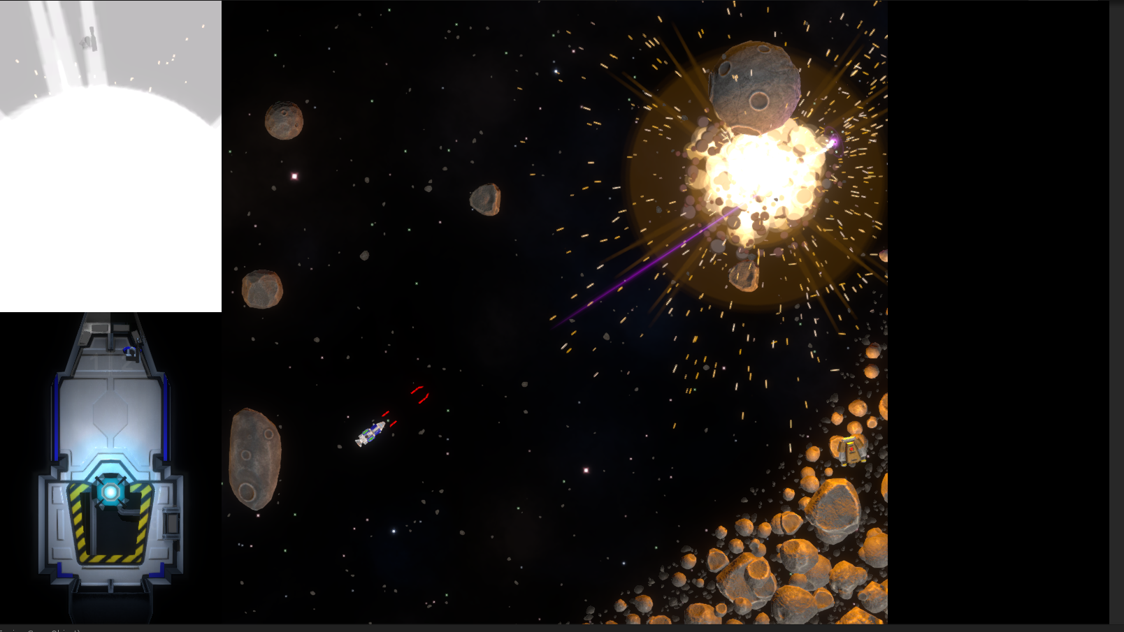
See the picture above. That is an explosion which could be used to demonstrate the concepts that I’ll be talking about this week, but instead I’m just going to leave it there, completely detached from this weeks dev diary except by happenstance to demonstrate that the inside of a ship blows up when the outside does. Perhaps after the reading of this post some thinkers amongst you might retroactively manage to attribute the title concept to this image, but I’m not doing the work for you. Right!. Onwards with the danger of being somewhat serious and even potentially useful.. If you are interested in game design, that is. If you aren’t then… erm.. “I’m halfway through making the the front end. Thank you for stopping by. See you next week”
This image is the very first menu that was in the game.
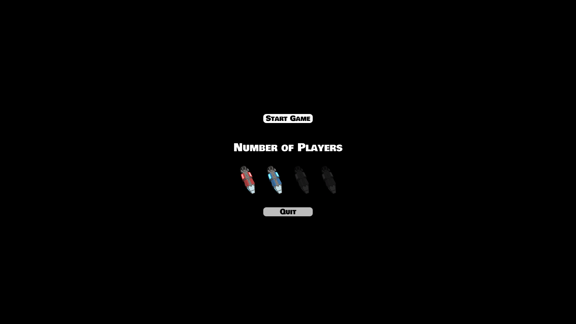
It’s very simple, and suits the purposes of the game fine… except it doesn’t. Nowhere near in fact. It was perhaps fine when there was a single level and each avatar was a single ship, on a different team, but the game is more complex than that and we wanted to offer more options for how a group might want to play. We’d also like to make it look a little nicer… maybe.
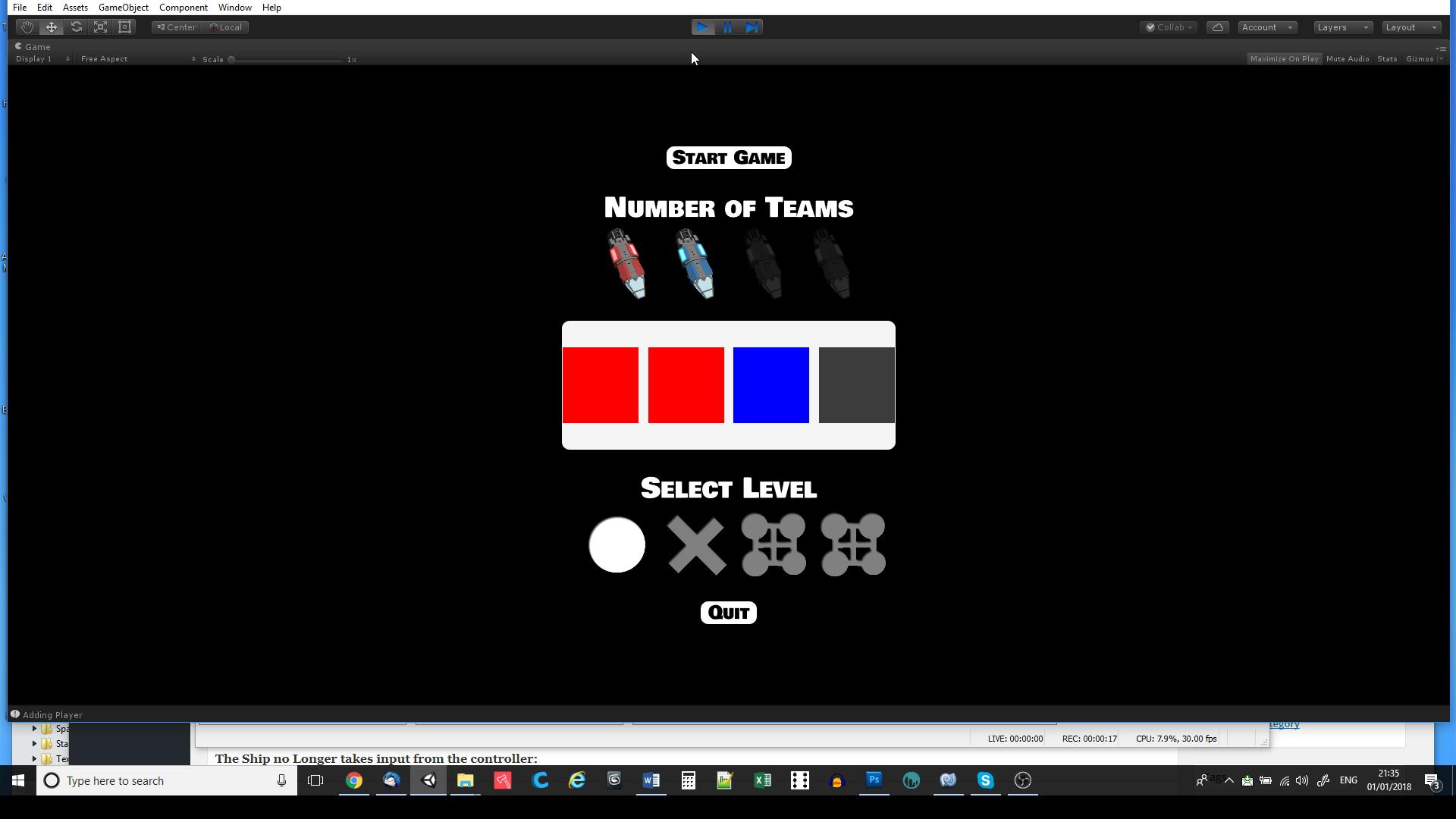
Here we go. Now We can level select, and in some fairly unclear way we can see some kind of team selection, but the difficulty here is multidimensional. That isn’t me being metaphorical, there are literally more than two dimensions needed for the setup of a ship if I want players to be able to choose all the things I want them to. Each player, needs to be able to choose a team, and a ship, so the only possible way to do this is to have a two stage process or work with a more complex selection system that can be understood and used. I realized early on that what I was really looking for was a three dimensional menu rather than a layered one, and that is how we moved onto the placeholder 3D menu.
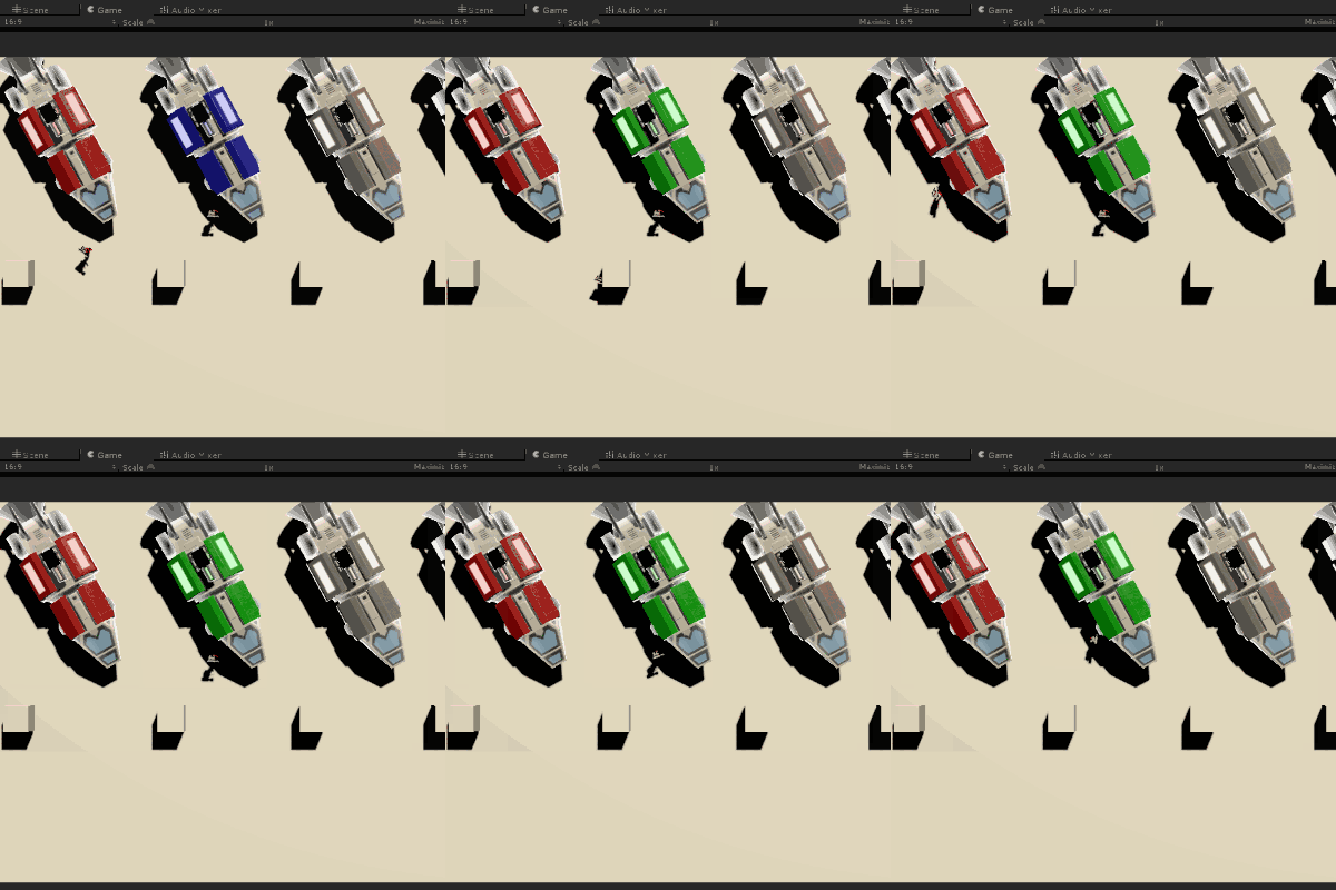
From this menu the player can do almost all of the things they need to (but not level select). They can bring ships into the game, select which ship they are going to get onto, and also select the team colour of each ship involved in the fray, or not have them in the game at all. The current issue is that it’s almost completely static so while the functionally is there, none of it is even in the slightest bit obvious. It’s also ugly as sin…
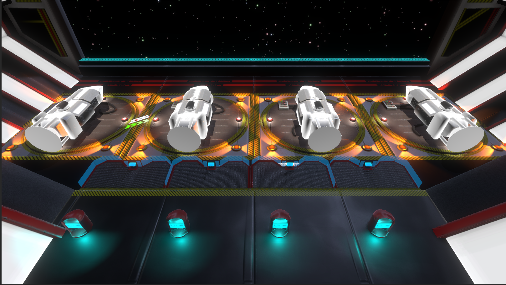
OK. Reasonable visual improvement. The perspective change was created so that we weren’t messing around with scales. In the previous menu system the ships were half their actual size, and the characters were four times their actual size. It not only looked a little weird, but also caused a few problems since these characters are the same ones used inside the game i.e. speeds and distances could not be consistent so I had to either hack them for the menu, or create a separate prefab that would need to be updated every time the characters changed. This was now the direction that we wanted to go. The level select layer still needed to be added and I’m confident I know how that is going to be handled, and you might even spot where it’s built into the design already. Next came the real challenge which is what the title of this post refers to. Conveying information to the player. Ben’s idea was simple.
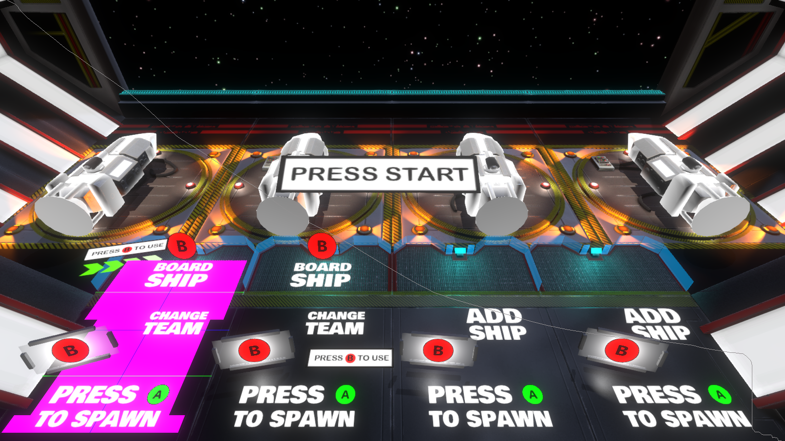
The main reason I’m including this image is because Ben spent a fair bit of time putting this together. When I told him it was all wrong and it goes against my design, he said he thought that I was intending to let my original design choices fall by the wayside. I was not. I fully understand why he might have thought that since implementing my intentions, while making the game simpler to the user, was going to be a significant challenge. Even if I’m completely wrong and have to redo it all (which is always a possibility I have to bear in mind), I’m determined to follow through on my design principles rather than leaving the ‘how to play’ aspect until later in development and then just shoehorning in a solution that mostly works. This time I really want a solution that sits as part of the gaming experience.
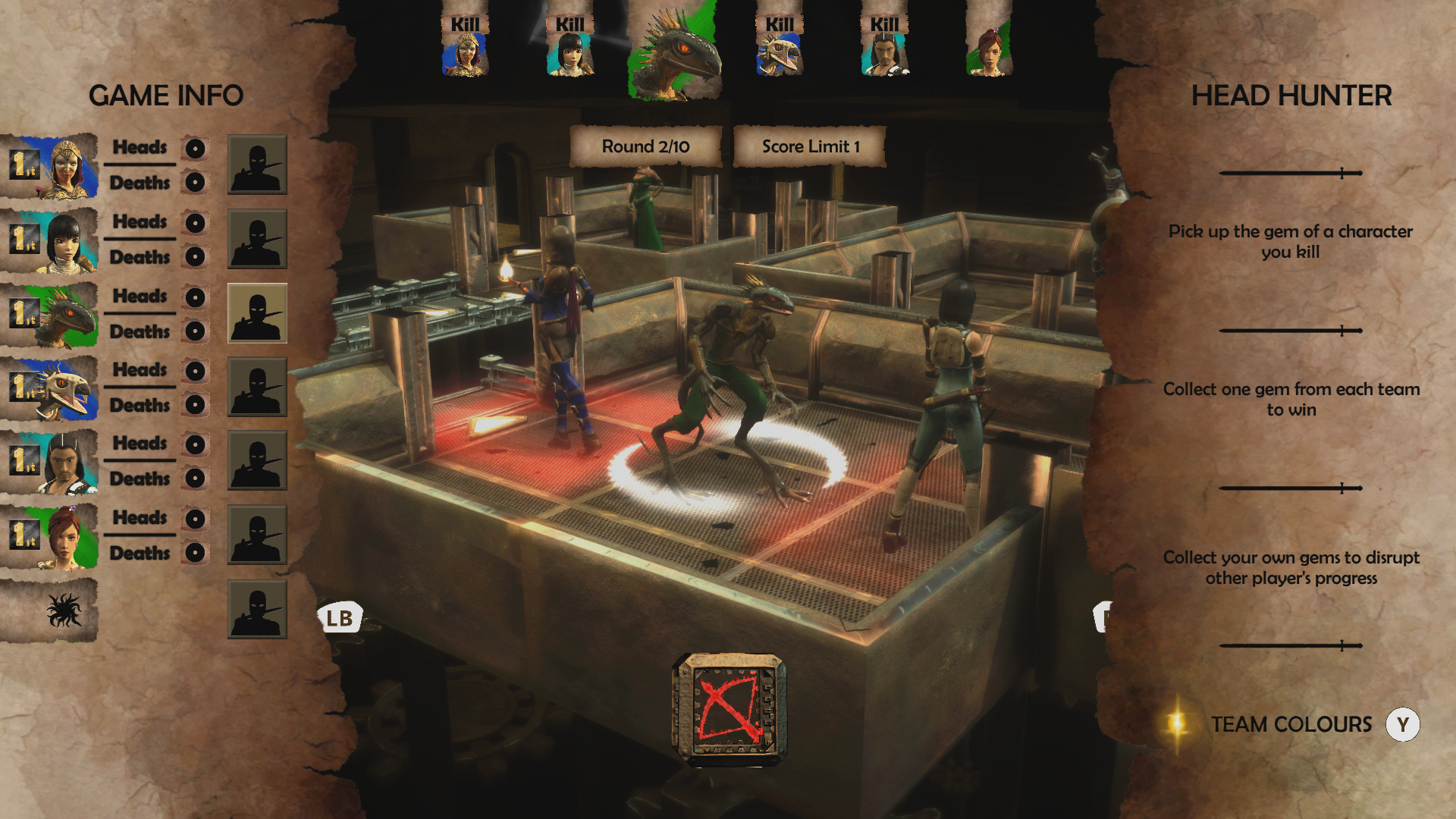
I can use my past successes/failures to explain this situation. For the most part, the Living Dungeon was a great game, and those who spent time playing it, by and large got to understand it and thrive on the challenges and opportunists the game allowed, but understanding those mechanics was a significant barrier to entry and the first thirty minutes of the game was effectively a long tutorial that didn’t truly let the player just have fun until afterwards. Strangely, you can expect that kind of thing, and be fine with it, in a huge triple-A title where you mostly already know what you are doing, but in a no name title you can afford to impulse buy, you usually want to just pick it up and have fun right? (That’s partly getting in to my failures as a marketer and how I failed to get my game to it’s intended audience. so I’m going to get back on track now). My point is that some players will invest the time in your game to figure it out and put up with any pacing issues or confusions you create, but they don’t owe that to you.
To Avoid that incredibly slow start on our next niche and hugely complicated title, “Dead Exit” we gave the player a very quick and fleeting tutorial, with multiple additional, optional methods of learning more about how to play. First there was a basic tutorial, then a basic, how to play video, then a full written list of the rules that the players could go over at their leisure. If they wanted some further understanding there were even some youtube videos demonstrating synergies, and some more advanced tactics. Again, for many players this was all good and time after time high scoring reviews would comes and say “Once you start to understand the game it’s a lot of fun and very deep”. That’s high praise and we are grateful for it, but it still meant that plenty of players would pick up the game, not be able to understand it, and just chuck it to the side in favour of something simpler or even just more familiar. There are many good reasons that most big digital card battle games just follow one of a couple of formulas. Familiarity with a little bit of novelty is often far more appealing than something completely alien. Combine familiar gameplay with a recognizable brand name and you have a no risk sizable audience. Only an idiot like me would try and do something completely different, deliberately keep it looking very much like a physical card game, and have no brand identity to speak of. I would have been far smarter trying to get a licensing deal with absolutely any zombie franchise just to have a small built in audience to allow my game mechanics to grow naturally from that. Now I am getting into my failures as a businessman, but I promise that both my weaknesses in both marketing and business are relevant to this post. I’m no good at either, and while I hope to improve one day, in the mean time I must try to find design solutions to compensate. As stupid as that sounds, it’s what I’m attempting.
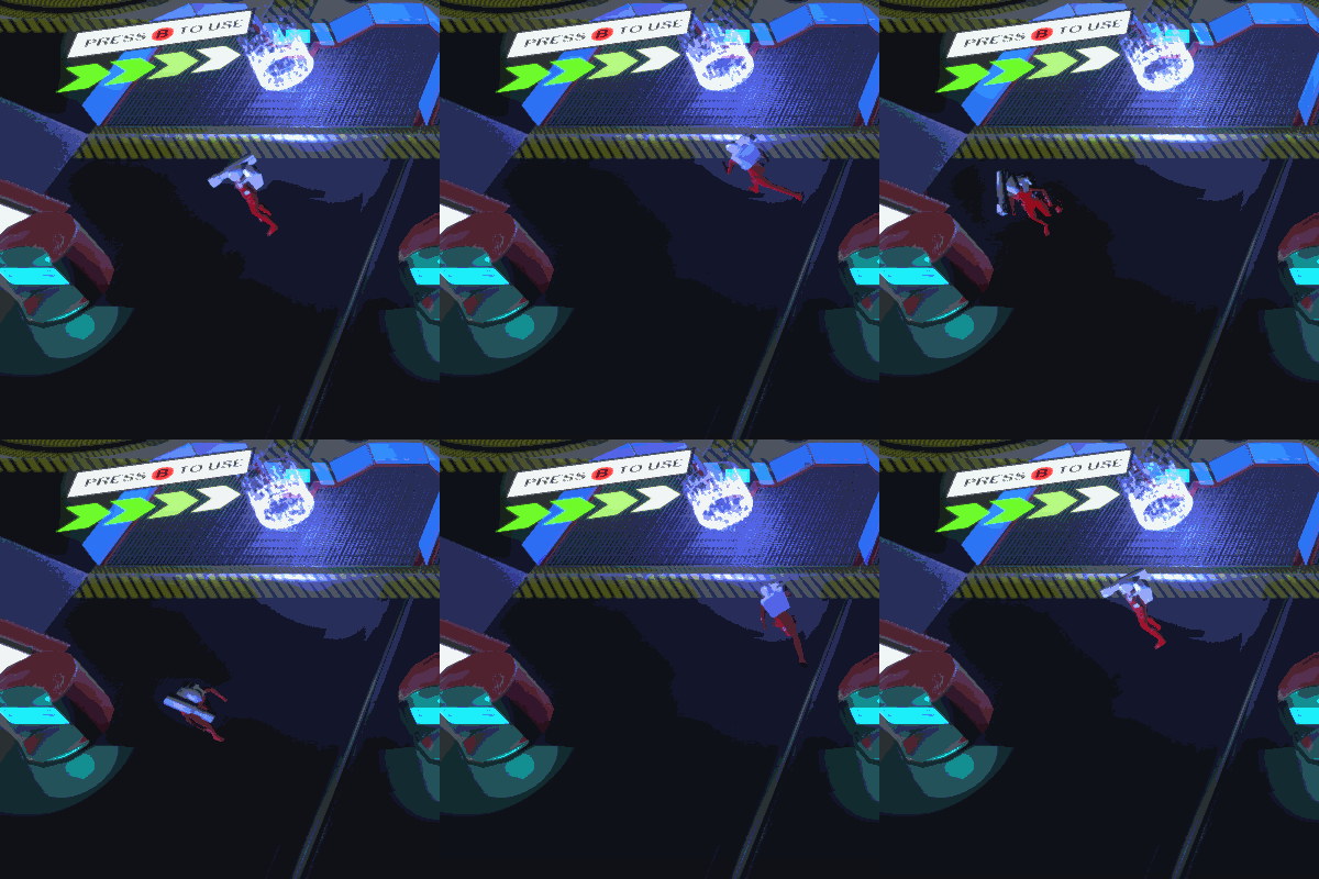
By the game’s completion (still hopeful I will be able to complete this game), there will be no words at all. Front end, tutorials, missions, weapons etc, etc. None of these things will have text explaining what to do. Nor will their be voice overs or videos. The players will need to figure out everything as they go. There will be hints, lights, psychological triggers, and even some little animations that infuse the player with understanding. They will learn by doing, and they will do what they want. The plan is to put some design understanding into guiding the player to do what they want out of curiosity or desire. I realize to most people this might sound like nonsense, but to designers and authors this should make sense. The idea of “giving people the choice to do what you would like them to, and have them thinking it’s their choice” is not a new one, and even though the front end is far from finished, the principle can be demonstrated by what we have already done in this badly put together video where I also go over some of the things I already mentioned in this post (for the illiterate among you who missed it).
As Always, feel free to get in touch via the usual thingummies. Those being Twitter, Facebook, and Youtube. Bye for now.


